This much is true – a book can't do without fonts. But which font for what? This is very often a big question.
You may have heard already that books should always be typeset with serif fonts. If you can also explain what is a serif font, then you have some knowledge of the topic. (Apart from that, the rule to always use serif fonts which we mentioned just now, isn't true in general.)
We would now like to introduce different terms to the fonts topic. Then we can talk about fonts much easier later.
If your principal or editor specifies font faces and font sizes,
lounge back and comply with his or her instruction faithfully. If not,
you should stop to think about fonts for your book now. Decide if you
would like to use a serif or a non-serif font as body font. Consult
books which you have read, and which you enjoyed reading. In this
context, enjoy
means that you may have read the relevant books
in one go, and have devoured the content with your eyes without any
thoughts about the fonts used. These books have chosen perfect fonts
in perfect font sizes.
Main task of fonts in a book is to convey the content.
It is not the task of fonts in a book to upstage and detract vainly from the content. Font face, font size, type area, page format, paper, etc. – all these factors in a book should only serve to convey the content while staying discreetly in the background like a perfect waiter.
The body font should have a good gray tone. This means a full text page should show a smooth gray area without gaps and spots when you have printed it and looked at it the wrong way around in your hands, with outstretched arms. Don't collapse laughing. In fact, this is the best way to judge body fonts. Sometimes you will recognize that the same font shows clear differences in readability when you use different line spacings.
As we don't want to see your being spoilt for choice, we will suggest some fonts for our next tasks on the way to the finished book.
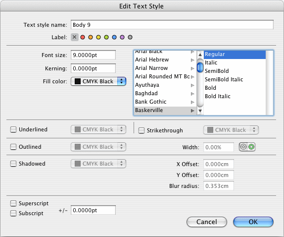
Text Style inspector. There you will see at least one text style named
Default. Double-click on the style name, and you will see the text style parameters dialog. Please adjust the parameters to use the style name
Body 9, the font face
Baskerville Regularwith 9 pt. Don't use any of the other offered gimmicks.
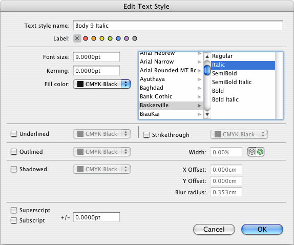
Text Style inspectorby selecting
Duplicate Text Stylein the action menu, and renaming the copy to
Body 9 Italic. The only parameter to change in this text style is to switch the font face from
Regularto
Italic. That's all!
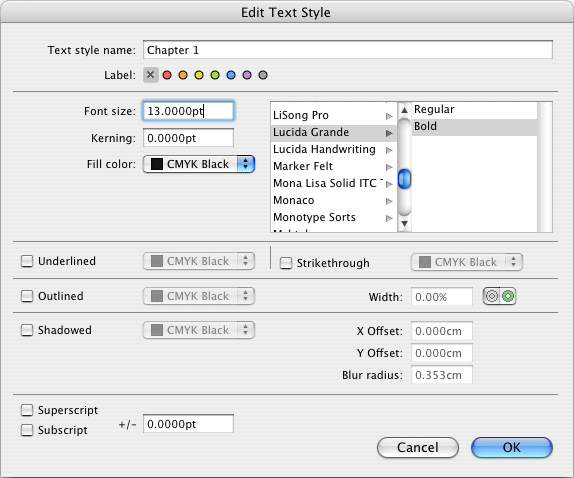
Chapter 1please. Choose the font face
Lucida Grande Boldand set the font size to 13 pt.
Chapter 1.1and
Chapter 1.1.1. Change their font size from 13 pt to 11 pt and 9 pt respectively.
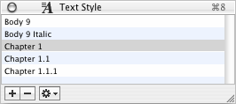
Now you have prepared the basic fonts as text styles in your book:
for body text (Body 9
), for accentuations in the body text
(Body 9 Italic
), as well as for three different chapter
hierarchy levels (Chapter 1
, Chapter 1.1
and Chapter
1.1.1
). If your book uses more than three chapter hierarchy levels
(chapter, subchapter, subsubchapter, subsubsubchapter ...), add
another text style Chapter 1.1.1.1
, and consider how to design
this text style.
Hint: Another remark on body fonts for accentuation: In
these days, it has become very popular (maybe because of the Internet)
to highlight single words in text by fattening
them. In the
long text of a book, bold or even semi-bold text styles will disturb
the gray tone of a book page. Therefore it is much more esthetic to
accentuate single words in italics, even if you might think at
first sight that it isn't weighty enough. Trust your reader's eyes.
He/she who reads your book page by page, hour by hour, will recognize
each single italic word and – without being disturbed in reading
– notice the higher importance of these words. More isn't more
here. Use accentuations sparingly and discreetly. Renounce triple
exclamation marks, underlining, color and other affectations which
would only emphasize your own uncertainty in dealing with your own
text. Let your text speak for itself. Your readers will value it.
