[Ten rozdział nie został jeszcze przetłumaczony.]
This much is true – a book can't do without fonts. But which font for what? This is very often a big question.
You may have heard already that books should always be typeset with serif fonts. If you can also explain what is a serif font, you are at a higher stage (apart from that the rule to always use serif fonts which we mentioned just now, isn't true in general).
We would like to introduce different terms to the topic fonts now. Then we can talk about fonts much easier later.
We talk about and use body fonts when long text (mass text) has to be typeset. First of all, these fonts should be characterized by being very readably in small font sizes (between 8 pt and 12 pt). Furthermore, they should not be too striking, as the reader's eyes should not be disturbed from reading by salient features of the font.
These fonts can be used for highlighting single words or headlines (accentuating), for separating citations from the main body text or for marking foreign words, etc. Accentuating fonts may be more eye-catching than body fonts by all means. In our context, typesetting a book, it is important to use an accentuating font which harmonizes with the body font. Hence it should offer a clear contrast to the body font.
Letters in these fonts are drawn with simple lines and don't show any serifs (small bulges, dashes or other emphases) at their line ends. Known representatives of this kind of font are Helvetica, Triumvirate, Avant Garde, Grotesk, Franklin Gothic, Futura, Kabel, Arial.
These fonts come along with the already mentioned serifs. In small font sizes it looks as if the single letters are aligned like in handwritten text. This may ease reading. Known representatives of serif fonts are Times, Garamond, Bembo, Bookman, Caslon, Goudy, Korinna, Palatino.
If your principal or editor instructs font faces and font sizes,
lounge back and use his or her instruction faithfully. If not, you
should stop to think about fonts for your book now. Decide if you
would like to use a serif or a non-serif font as body font. Consult
books which you have read already and which you enjoyed to read. In
this context, enjoy
means that you may have read the relevant
books in one go and have devoured the content with your eyes without
any thoughts about the used fonts. These books have chosen perfect
fonts in perfect font sizes.
Main task of fonts in a book is to convey the content.
It is not task of fonts in a book to upstage and deflect vainly from the content. Font face, font size, type area, page format, paper etc. – all these factors in a book should only serve to convey the content and stay discreetly in the background like a perfect waiter.
The body font should have a good gray tone. This means a full text page should show a smooth gray area without gaps and spots when you have printed it and watch it the wrong way around in your hands, with stretched arms. Don't refrain laughing. But in fact this is the best way to judge body fonts. If necessary, you will recognize that the same font shows clear differences in readability when you use different line distances.
As we don't want to see you being spoilt for choice, we suggest some fonts for our further works on the way to the finished book.
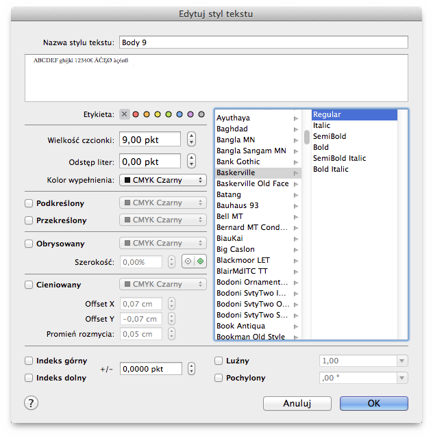
Please open the Text Style inspector now. You will see there at
least one text style named Domyślny
. Double-click on the style
name. You will then see the text style parameters dialog. Please
adjust the parameters to use the style name Body 9
, the font
face Baskerville Regular
with 9 pt. Don't use any of the other
offered gimmicks.
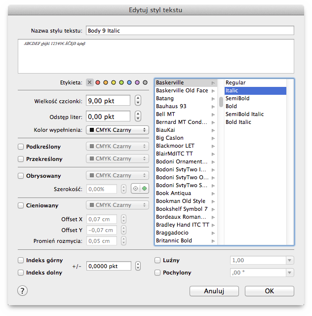
Now copy the text style in the Text Style inspector by
selecting Duplicate Text Style
in the action menu and renaming
the copy to Body 9 Italic
. The only parameter change in this
text style is switching the font face from Regular
to
Italic
. That's all!
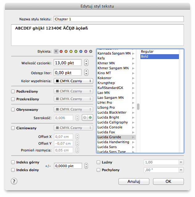
Now create a third text style and name it Chapter 1
please. Choose the font face Lucida Grande Bold
and set the
font size to 13 pt.
Copy the third text style twice and adjust both the copies in a
way that they are named Chapter 1.1
resp. Chapter 1.1.1
.
Change their font size from 13 pt to 11 pt resp. 9 pt.
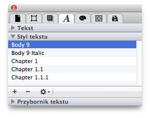
Now you have prepared the basically used fonts as text styles in
your book: for body text (Body 9
), for accentuations in the
body text (Body 9 Italic
) as well as for three different
chapter hierarchy levels (Chapter 1
, Chapter 1.1
and
Chapter 1.1.1
). If your book uses more than three chapter
hierarchy levels (chapter, subchapter, subsubchapter, subsubsubchapter
...), add another text style Chapter 1.1.1.1
and consider how
to design this text style.
fatteningthem. In the long text of a book, bold or even semi-bold text styles will disturb the gray tone of a book page. Therefore it is much more esthetical to accentuate single words in italics even if you might think at first sight it isn't weighty enough. Trust your reader's eyes. He/she who reads your book page by page, hour by hour, will recognize each single italic word and – without being disturbed in reading – notice the higher importance of these words. More isn't more here. Use accentuations sparingly and discreetly. Renounce triple exclamation marks, underlining, color and other attitudes which would only emphasize your own uncertainty in dealing with your own text. Let your text speak for itself. Your readers will value it.
